I really want to develop my linear work with more contemporary themes. Hopefully I can find my 'style' and feel comfortable with it...
Mina Fina:
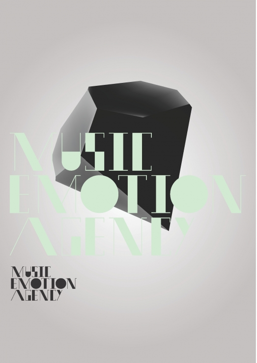
I love the use of tone in these images. The typeface created is fresh and innovative, very much reflective of the brand.
A visual identity project for a music agency in Columbia, I found these while looking through a magazine and taking further research into visual communications VBG (Visual Brain Gravity) http://www.vbg.si/en/
A couple of months ago I subscribed to a lovely service. A service that brings together some of the world's best independent magazines. Interesting mainly from a design perspective, I particularly enjoyed this month's surprise package! The ldN (International Designers Network) prides itself on doing all the things that are normally considered too expensive or too difficult to do with ink on paper, a policy that has helped it grow into one of the world’s most highly regarded design magazines. A jumble of visuals was what I loved the most, it was up to you where to start reading and you controlled how to read it! Lovely paper and print showcasing interesting examples of graphic design and illustration. An interest introduced to me was the typographic work from Tom Davie, graphic designer http://studiotwentysix2.com
I never work much with the use of typography and every time I look through sources of inspiration they always make me wish that I did!
The degree show is a day away and our promotional postcards have arrived! I am quite pleased with them, I think they represent my strengths with linear work and composition. Can't wait to send some of these out to potential employers...
These were done as part of a self branding project at university. I wanted to work with something that could be easy to reproduce, and that kept within the style of some of my hand made working methods. I still think this needs some work as I am unsure if it speaks for my graphic design work and is it 'professional' enough to present to potential employers working in this discipline?
However, from these examples I went onto create a longer format so that I could fit the spreads from magazine projects within a single panel. Envelopes are my next step, something simple and again using the 'hand-made' themes.